La buena vida
Improving structure, hierarchy and interaction for a more accessible bookstore
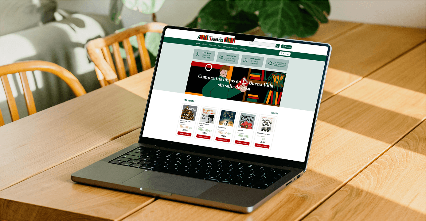
Overview
I conducted a heuristic analysis of La Buena Vida, an independent bookstore’s website, to detect usability issues, visual inconsistencies, and accessibility barriers. The goal was to enhance the homepage experience by improving readability, layout clarity, and interactive feedback—without compromising the richness of the original content.
Rol
UX/UI Designer
Methodology
Heuristic Analysis
Timeline
1 Weeks
Skills
UX Design | UX Audit | Branding
The Challenge
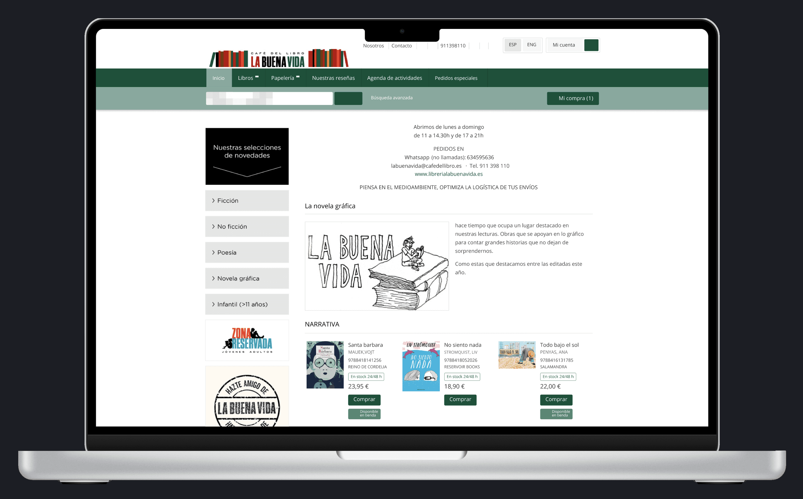
The website suffered from small typography, low contrast, and a lack of clear visual hierarchy. Book listings appeared cluttered, with cards showing excessive information and no clear entry point. Key UI elements lacked hover and active states, making interaction less intuitive and the overall experience visually overwhelming.
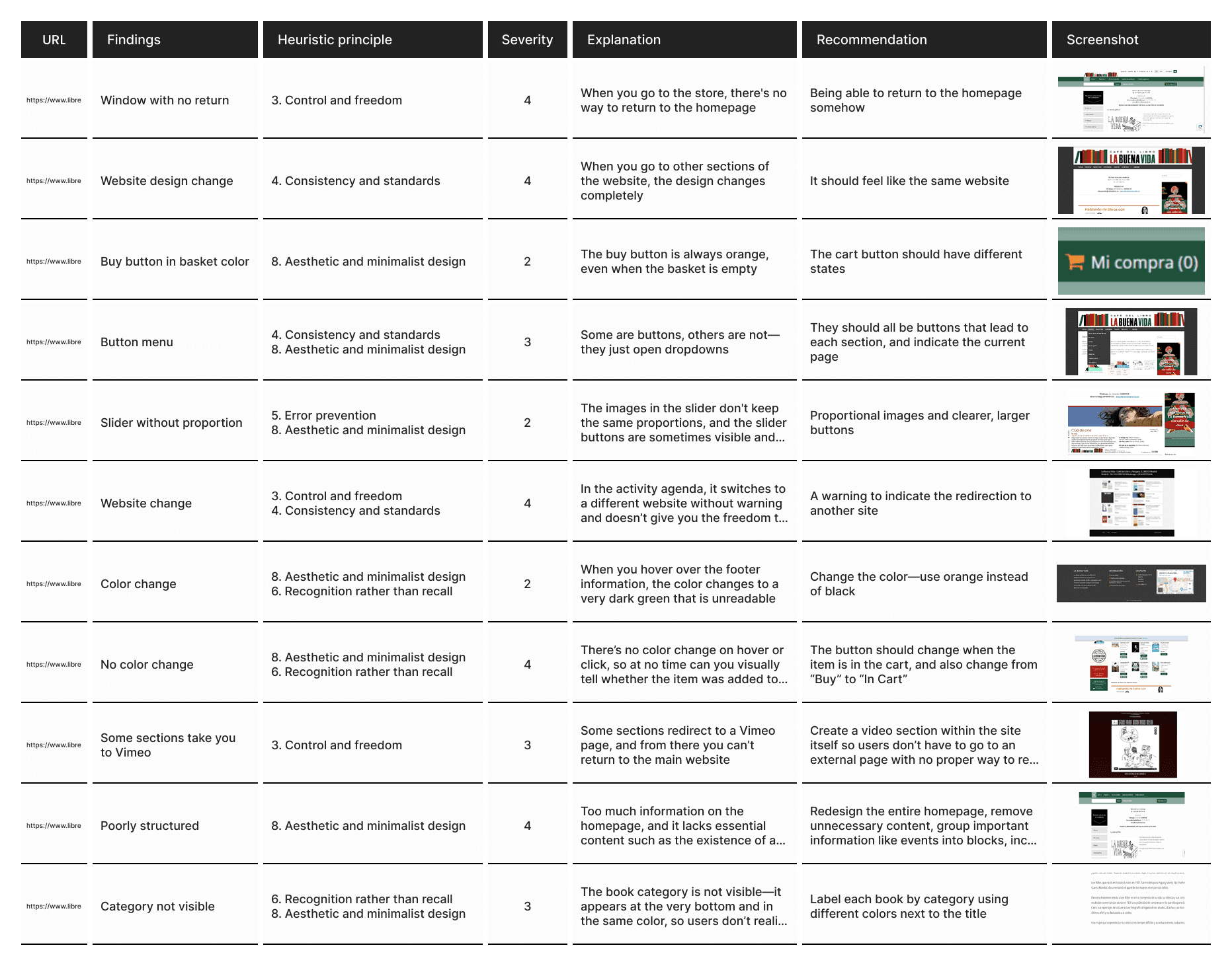
Heuristic Evaluation Table
As part of the redesign process, I performed a heuristic evaluation based on Nielsen’s 10 usability heuristics. The table below highlights the key usability problems found on the homepage and the proposed solutions that guided the redesign.
Solution
Using Nielsen’s heuristics, I identified key areas for improvement and proposed a redesign of the homepage focused on accessibility, clarity, and consistency:
Improved legibility through larger typography and better spacing.
Clean, scannable book cards with clear structure and emphasis on titles and calls to action.
Visual hierarchy and contrast enhancements to guide user attention.
Simplified and grouped content to reduce cognitive load without losing essential information.
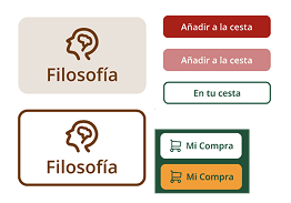
Interactive feedback through added hover and pressed states on clickable elements.
Key Improvements Breakdown
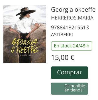
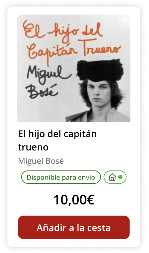
Cards – From Overloaded to Scannable
Before: Cards displayed too much information, with poor hierarchy and no visual grouping.
After: Each card now focuses on title, author, and one CTA, using whitespace and alignment for a clean look.
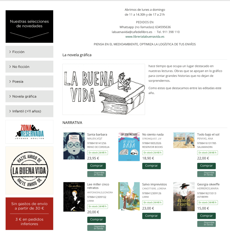
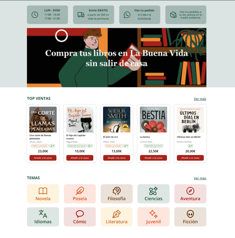
Homepage Layout – From Overwhelming to Clear and Structured
Before: The homepage displayed an overload of information with little prioritization, making it hard for users to focus. Key content was missing entirely, and the lack of structure made the site feel disorganized and overwhelming.
After: unnecessary content was removed, information was grouped into clear blocks , including a visual banner to drive engagement. This improved both content discoverability and the overall user flow.
Navigation & Interactions
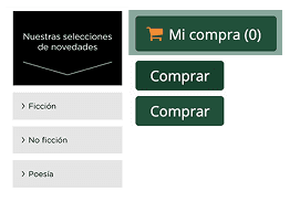
Before: No hover or pressed states; users couldn't tell what was clickable.
After: Clear visual feedback was added to all buttons, links and cards on hover or tap.
The Result
The redesign significantly improved the site’s readability, accessibility, and user interaction—while preserving its literary identity. By clarifying the visual hierarchy, simplifying content, and adding interactive feedback, the experience now feels more organized, inviting, and easier to navigate. Users can explore books comfortably, with a clearer and more thoughtful interface that supports both usability and the spirit of the bookstore.