Wonnai
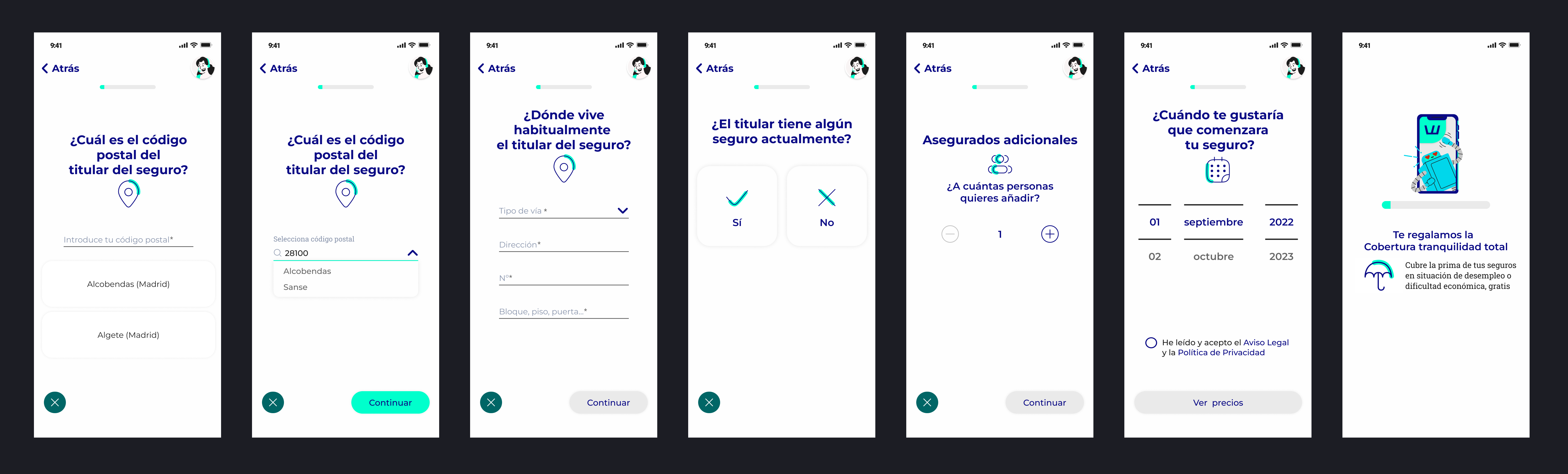
Wonnai sought ways to improve its application to make it easier to understand and to simplify the insurance contracting processes, making them much more straightforward and user-friendly for its users.
Rol
UX/UI Designer
Tools
Figma
Timeline
3 Months
Skills
UI Design | Redesign

Context
Analysis of the current situation
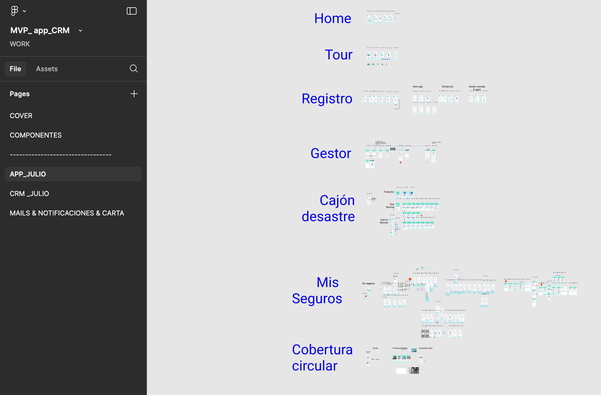
The application’s design was initially contained within a single Figma document.
All flows were placed on a single page, with each section labeled by a large text header.
While this setup provided a basic level of organization, it lacked clarity and made collaboration challenging.
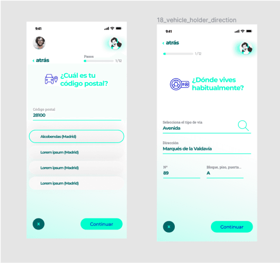
Upon reviewing the app’s interface, two significant issues became apparent. The first was a lack of visual consistency.
Elements frequently changed positions between screens without a logical reason, and in some cases, important components were missing altogether in certain steps of the process.
This inconsistency made navigation and comprehension more difficult for users.
The second issue was related to accessibility and visual fatigue. The app’s primary color, a bright turquoise, was used excessively and inappropriately, failing to provide sufficient contrast against the background.
This problem was compounded by the presence of a highly saturated electric blue, which clashed with the turquoise and created visual noise. The use of gradients in the background further distracted from the information and made it hard for users to focus on key content.
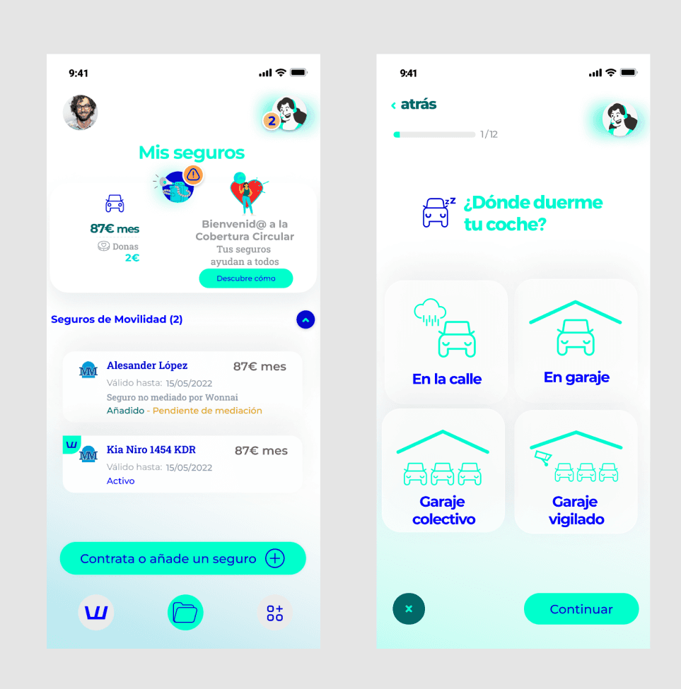
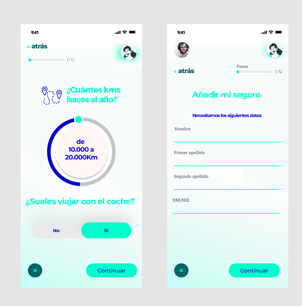
Interactive elements, such as buttons, lacked states to indicate their functionality, leading to user confusion.
Additionally, certain design choices, like a mileage wheel intended to resemble a game, excluded users with limited mobility or coordination, as there was no alternative input option.
Design Process
The redesign was approached in three main phases:
1. Reorganizing the Project
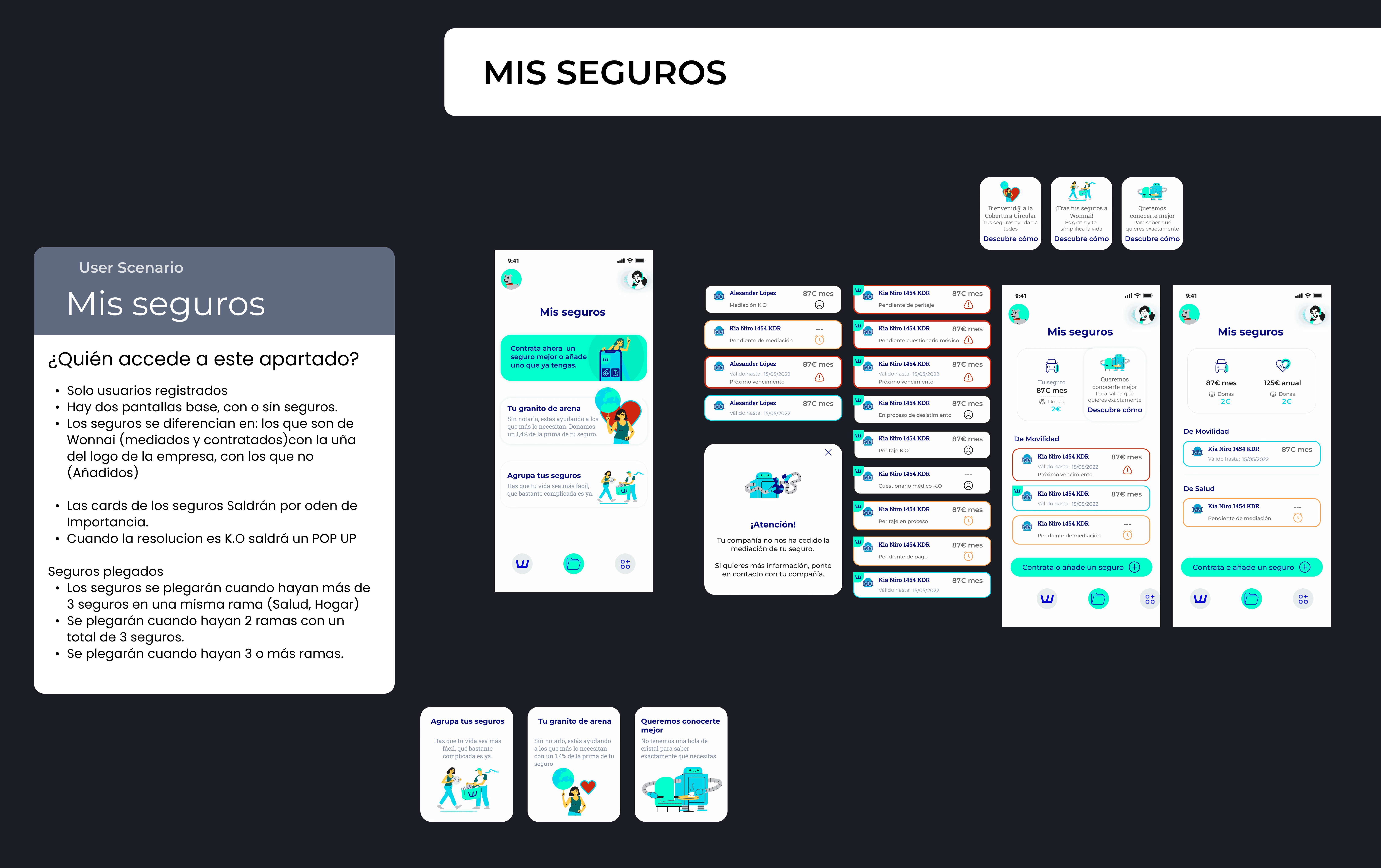
To ensure clarity and collaboration among team members, I reorganized the Figma file.
The app was divided into two areas:
Features accessible without registration.
Features requiring registration to finalize the process or access additional services.
Dedicated pages were created for each global functionality.
Within each page, sections identified the specific flow, accompanied by brief descriptions outlining access permissions and the intended user experience.
2. Enhancing Accessibility and Reducing Visual Fatigue
To improve usability and meet accessibility standards, I implemented the following changes:
Simplified background design: Removed distracting gradients
Improved color usage: Avoided turquoise for key information and replaced secondary colors with less saturated options.
Improved focus hierarchy: Reduced icon sizes to prioritize textual content.
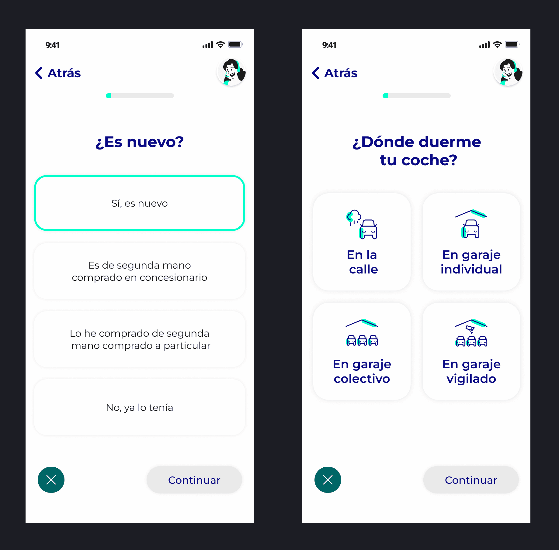
Typography optimization: Increased font size and switched to a more legible typeface.
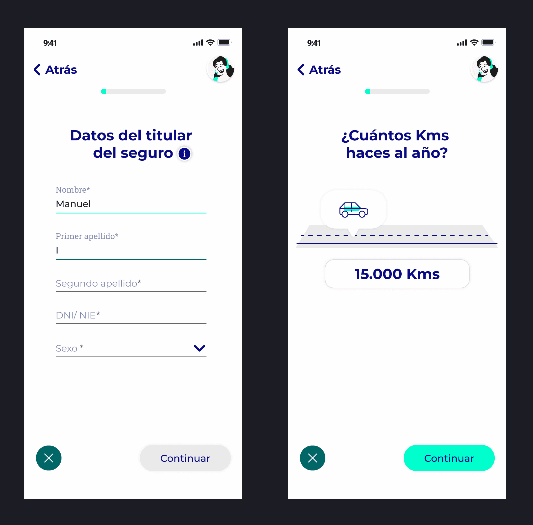
Manual input options: Updated interactive elements like the mileage wheel to allow alternative inputs for users with mobility challenges.
Interactive states: Introduced clear button and input states.
Dual indicators for states: Incorporated feedback through both color and iconography.
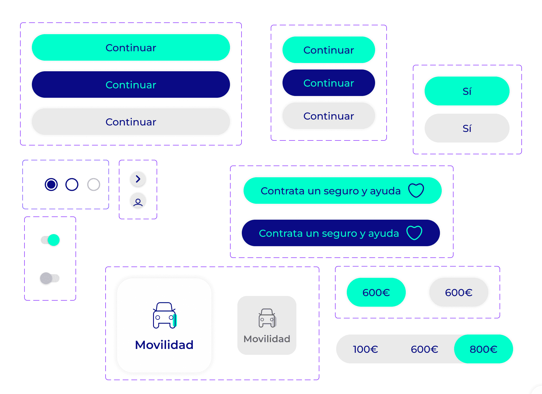
3. Establishing Consistency with a UI Kit
Instead of developing a full design system, I created a componentized UI Kit, appropriate for the project’s current scale and phase.
The UI Kit established a cohesive visual and interaction language for the product.
It laid a strong foundation for potential expansion into a full design system as the application evolves.
Outcome
The result was a visually harmonious and accessible application with a streamlined process that allows users to easily complete appraisals and purchase insurance.
The UI Kit and improved organization enable the team to efficiently create new features while maintaining a cohesive user experience.