Skool
Social networks are an integral part of our daily lives. While many claim to use them for work, the reality is that we often end up wasting hours scrolling through glimpses of other people’s lives. But what if we could change that?
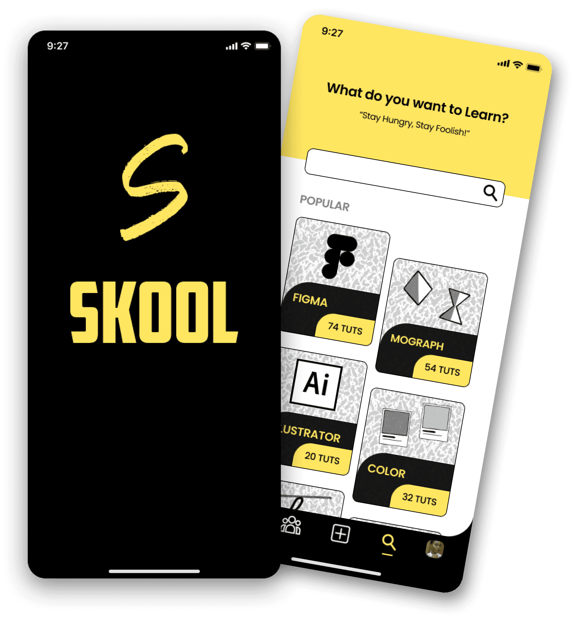
Skool is the social network built for learning. No personal photos, no life stories—just tutorials and posts from professionals in the creative sector.
Learning has never been easier!
Rol
UX/UI Designer
Tools
Figma | Whimsical | Procreate
Timeline
3 Weeks
Skills
UX Research |UI Design | Design Thinking
Research
To design a better social network, we asked a few critical questions:
What does an ideal social network look like?
How can we ensure it supports mental health?
How can we create something better than the platforms we already have?
To answer these questions, we employed several research techniques, including Desk Research, Netnography, Surveys, Interviews, SWOT Analysis, and Benchmarking. Among these, the research questions proved particularly valuable.
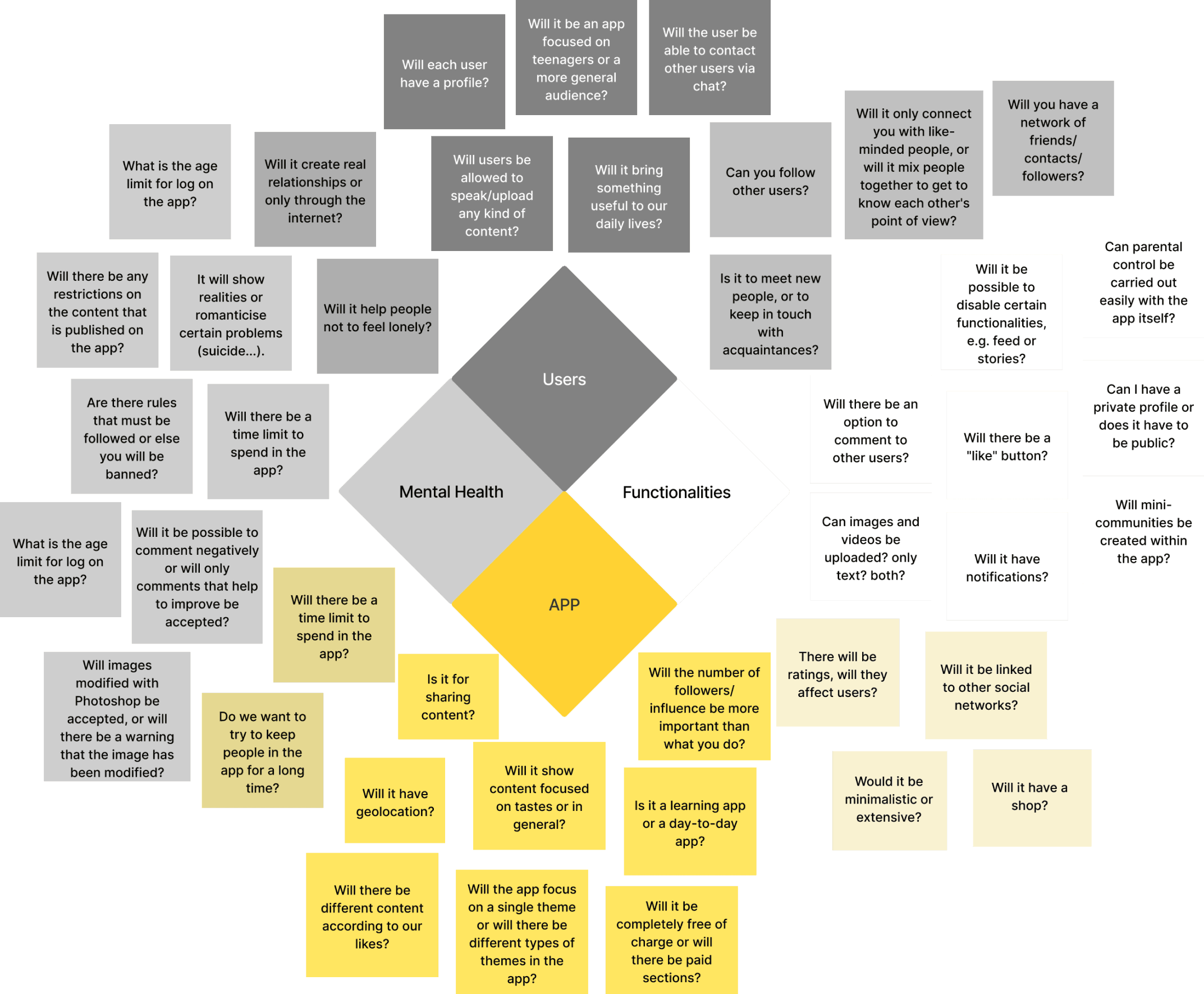
The foundational questions were categorized into four main areas: app design, user behavior, mental health, and functionalities.
Since this project involved creating a social network from scratch, we also conducted a competitive benchmark analysis to ensure our app would stand out in the market.
Insights
Who are our users? How do they interact with social network?
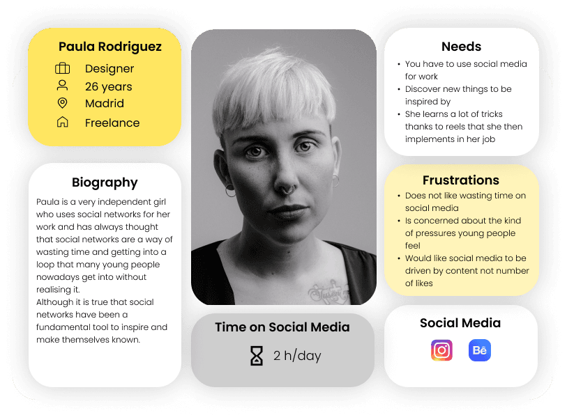
The focus of our Users Persona are young adult people from 18-35 years. What is more valuable to us is to understand how they interact and use social media in their lives.
For this part we used:
Users Persona
Empathy Map
Customer Journey
Pain Point
These tools helped us stay user-focused, identifying needs and desires to simplify the entire process. With this clarity, we confidently guided the next steps of the project, ensuring we addressed our users’ needs and expectations.
Ideation
During brainstorming, supported by an Affinity Diagram, we discovered that mental health and the nature of the content on our app would set it apart from existing platforms.
This realization led us to prioritize creating an app where users maintain full control over their experience.
By focusing on meaningful content and prioritizing well-being, Skool offers a fresh take on social networking—a space dedicated to learning, creativity, and self-improvement.
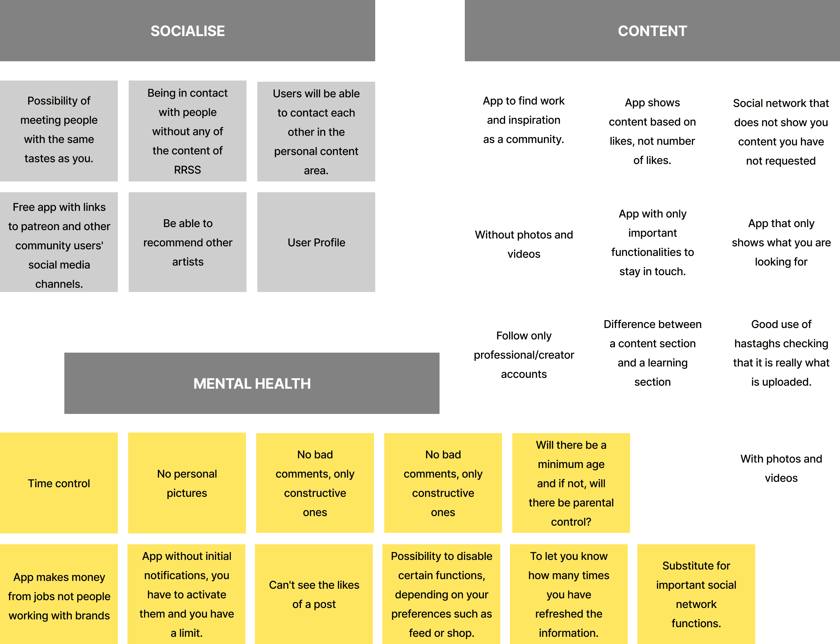

With these ideas in mind, we began selecting the best ones. The first step in this process was using a Priority Matrix, which helped us identify the most useful and viable ideas.
Once the top ideas were selected, we used the MoSCoW method for final prioritization.
At this stage, we defined what we considered the "perfect" social network.
Design
We then moved to the development phase, turning our ideas into a tangible prototype.
To establish the app's information architecture, we created a site map and a user flowchart, allowing us to visualize how users would interact with the platform. With the architecture finalized, the next step was designing mid-fidelity (Mi-Fi) wireframes to outline the app's structure and functionality.
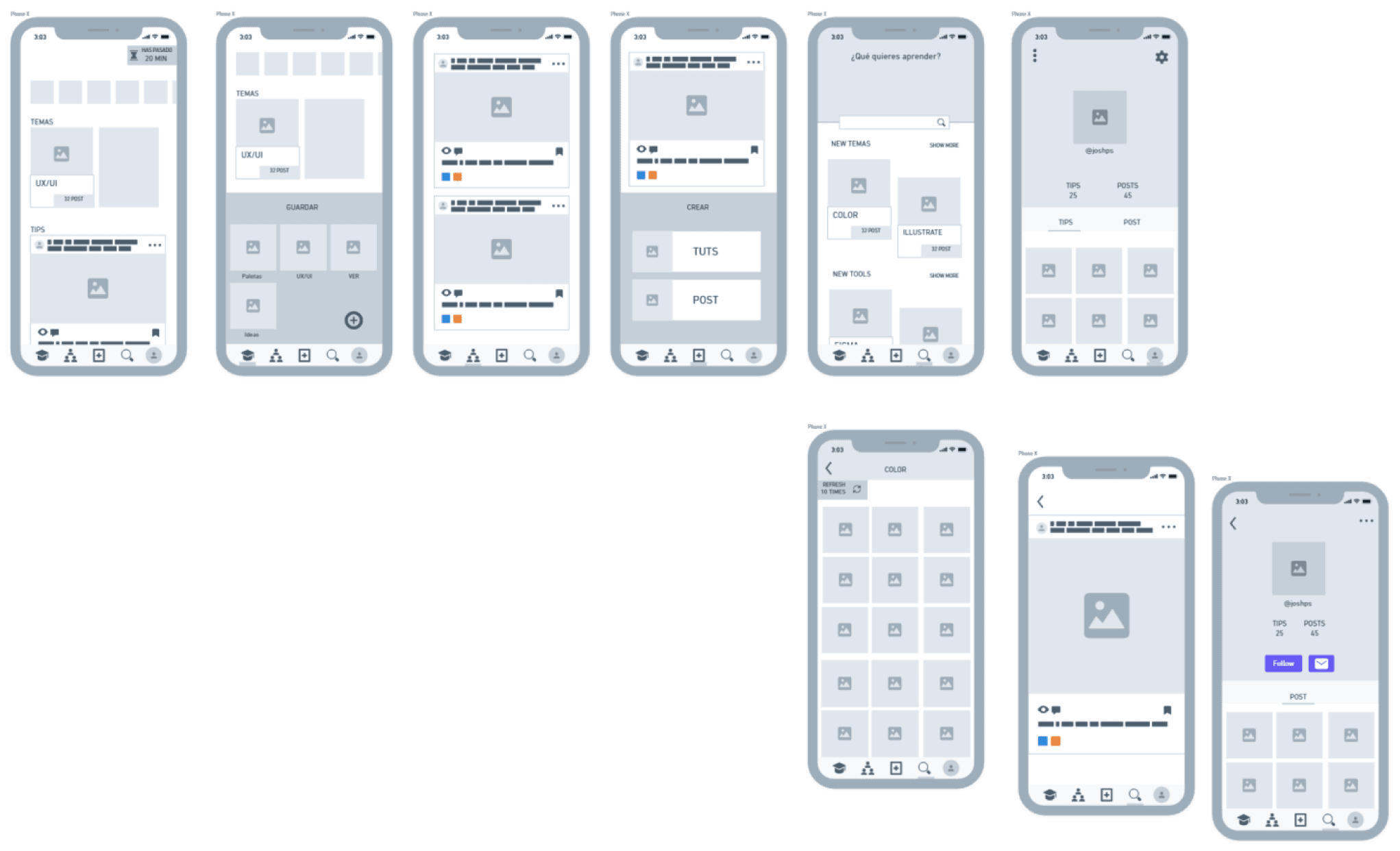
Following this, we crafted the platform’s visual identity, including: choosing color palettes, selecting typography, designing the logo and creating illustrations to align with the feed's themes.
With the visual identity complete, we developed high-fidelity (Hi-Fi) wireframes and finalized the app prototype.

Conclusions
As the way people feel about and interact with social media evolves, it’s clear that a shift is needed in how we design and use these platforms.
As designers, we bear a significant responsibility to create social networks that are ethical and genuinely beneficial for users.
Technology is no longer just a pastime; it’s an integral part of daily life. Therefore, designing responsible applications that promote conscious use is essential for fostering a healthier and more connected society.
Check the entire project on: